Earth First
Earth First
Branding • Freelance
Branding • Freelance
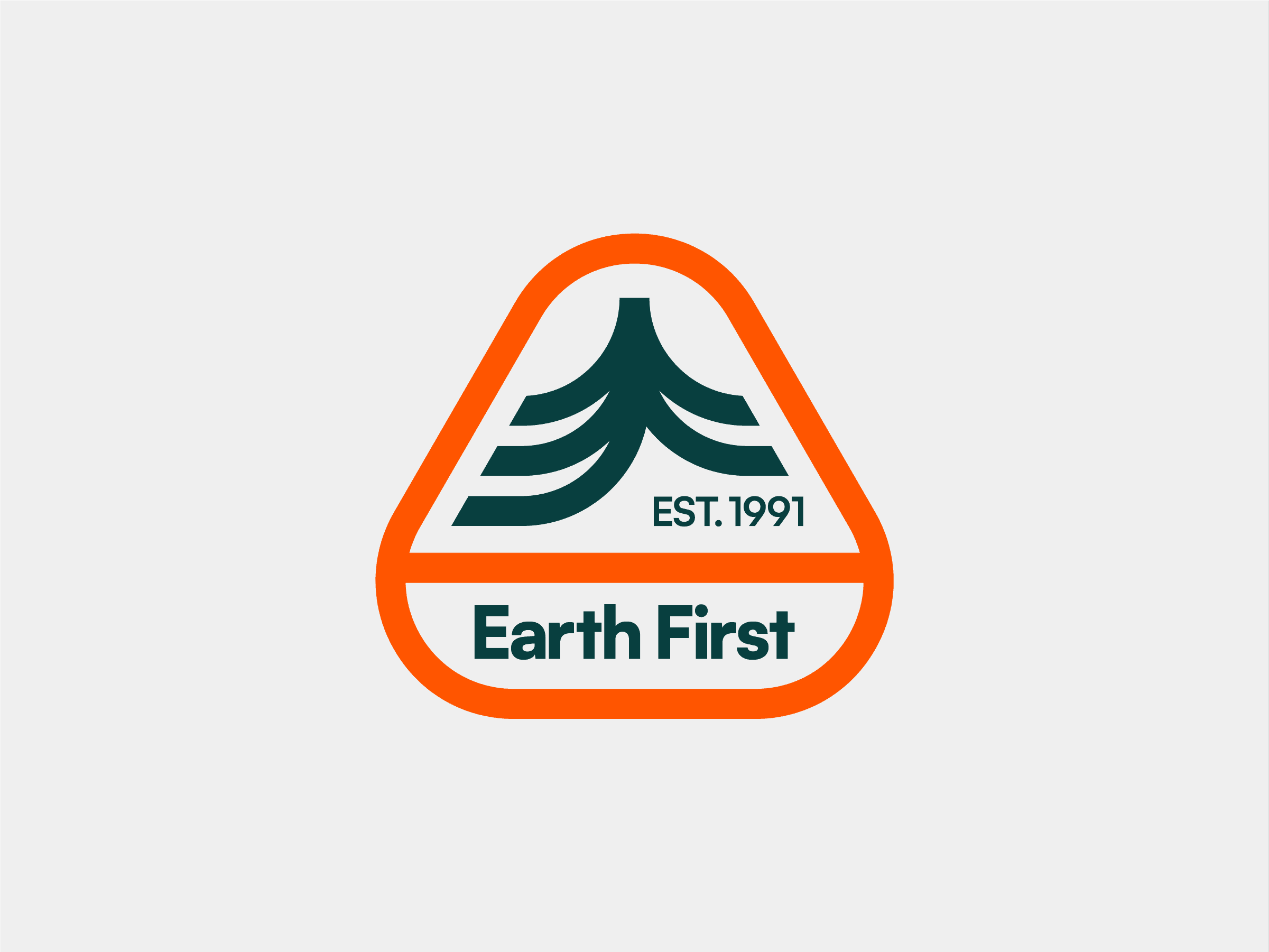
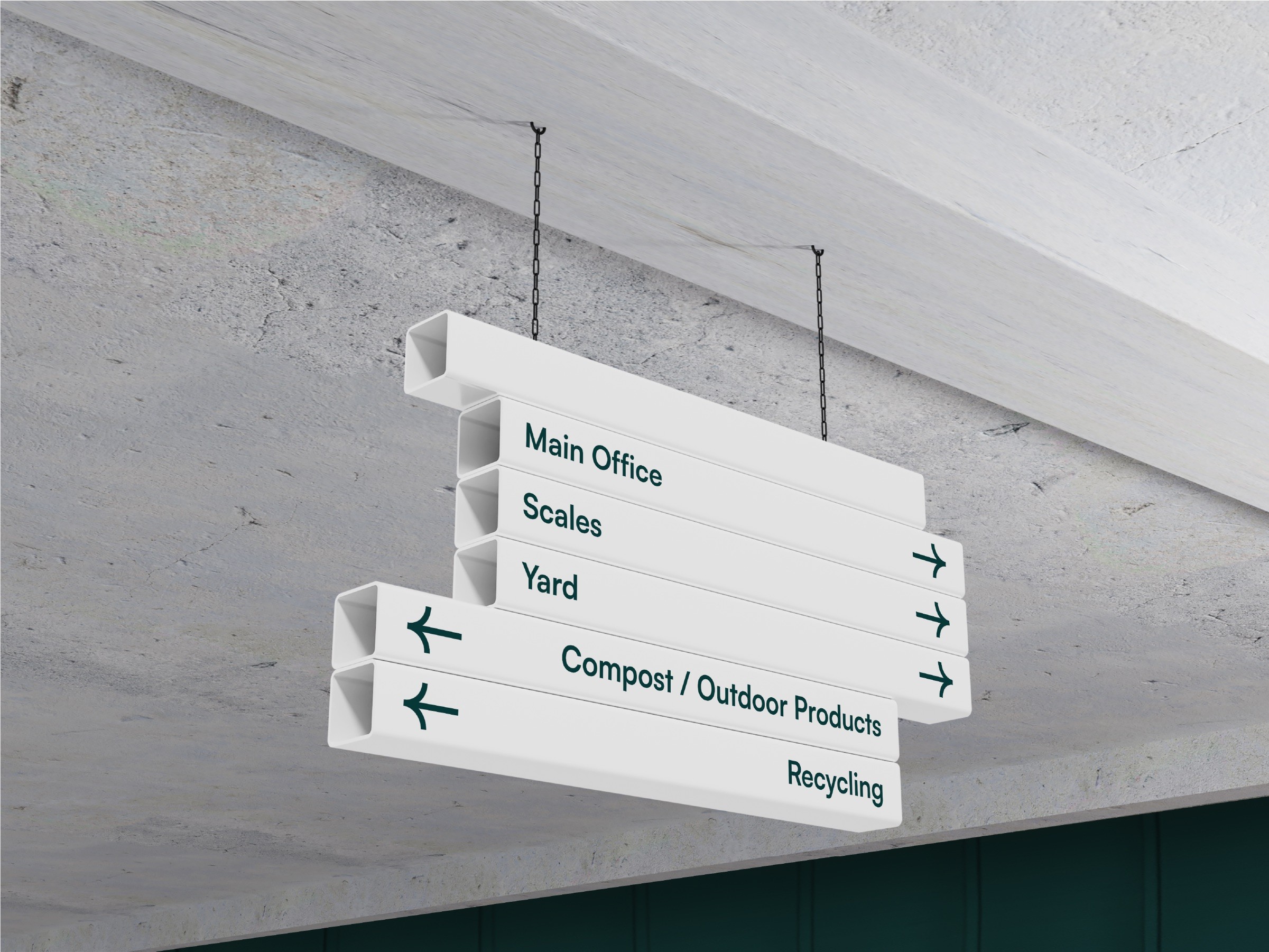
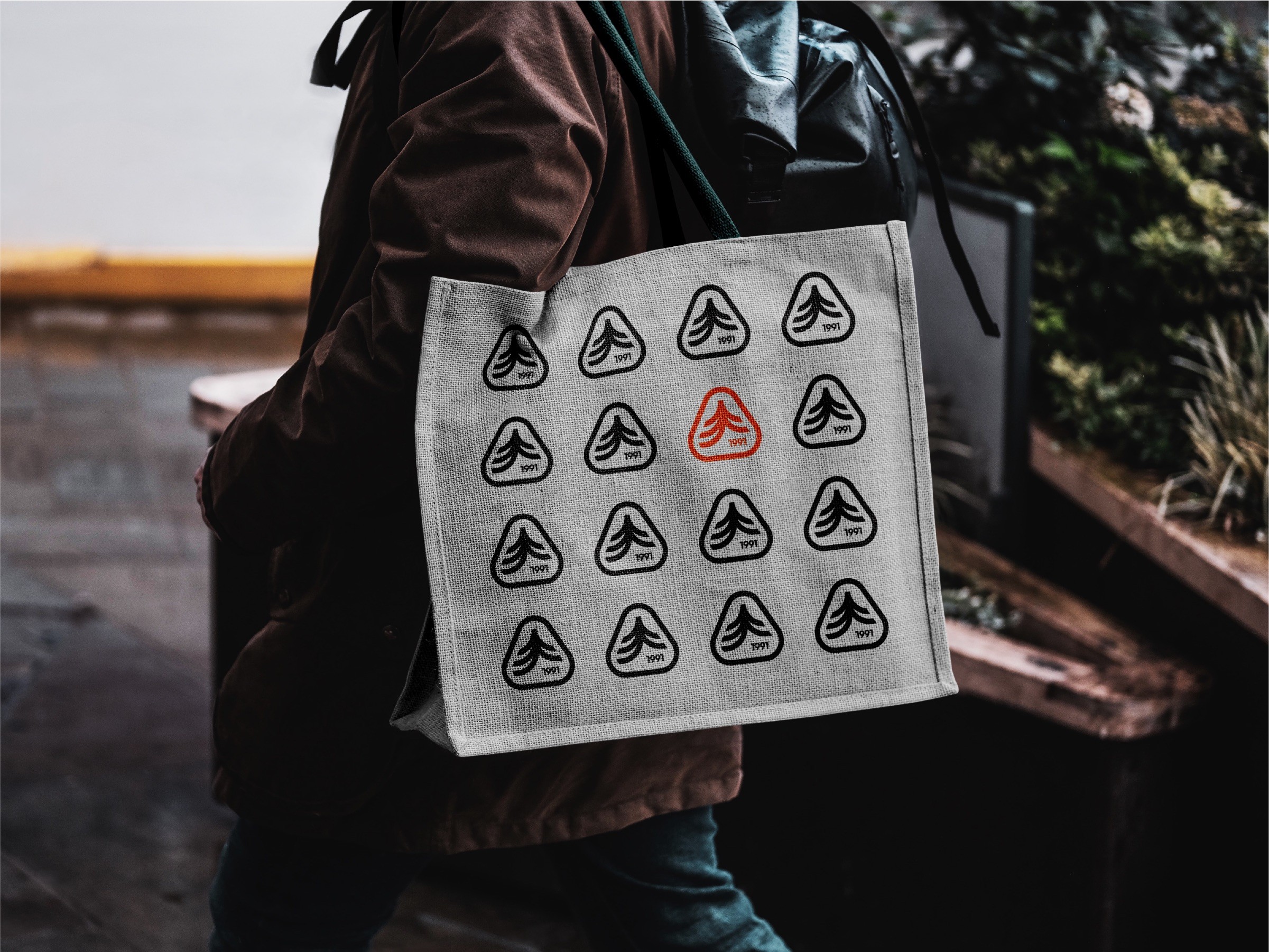
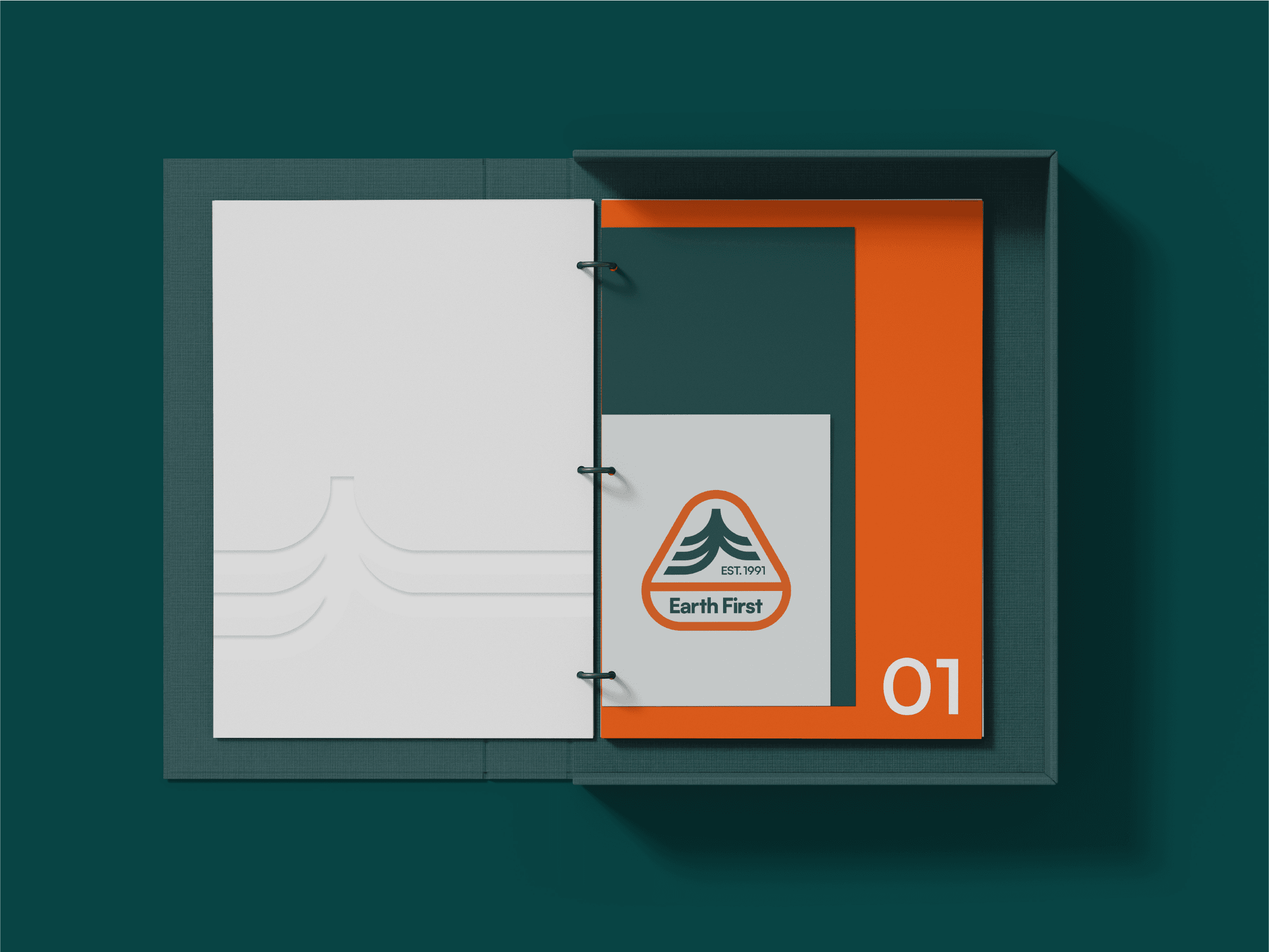
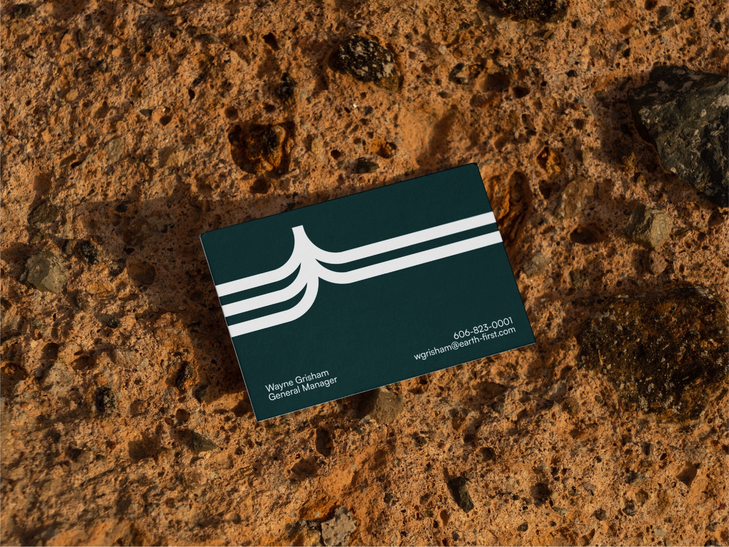
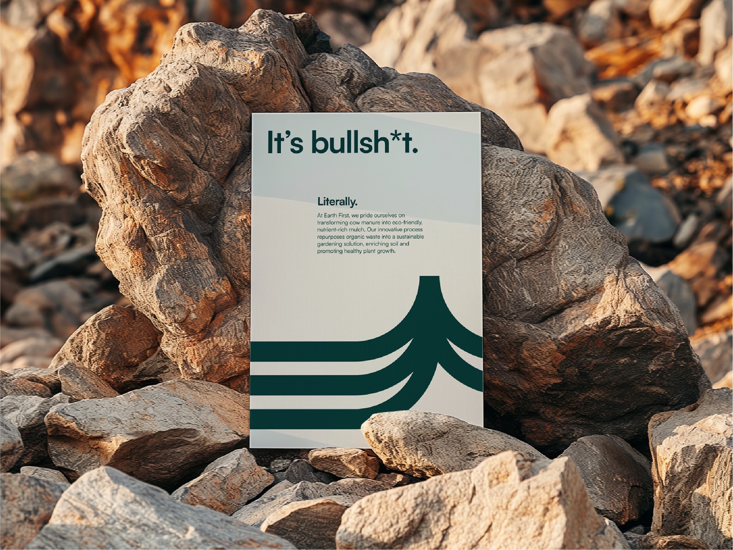
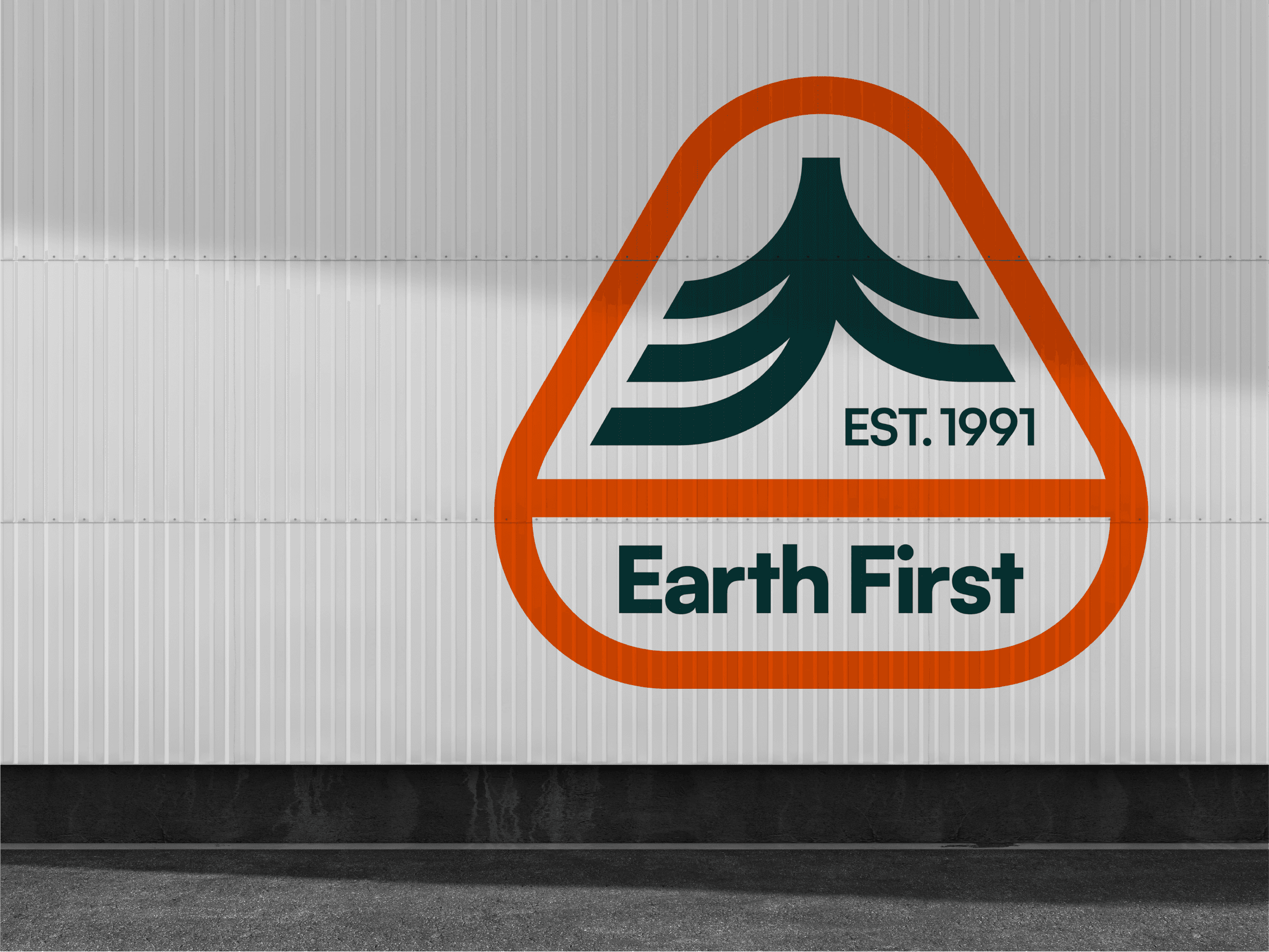
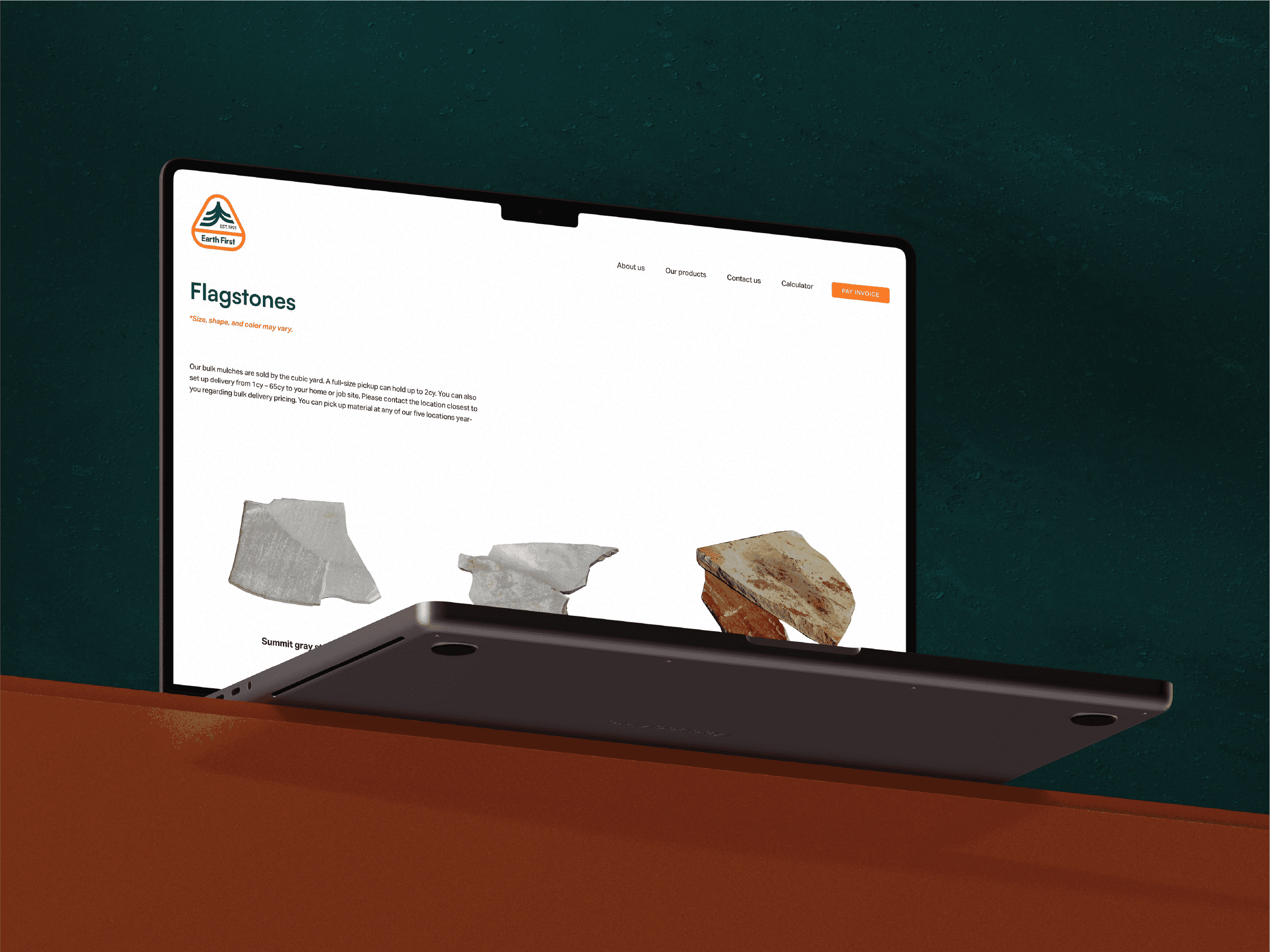
The Earth First brand identity contrasts the gritty, hands-on nature of mulching with a clean, modern, and spacious design. The logo subtly incorporates three meanings—arrows symbolizing recycling, a tree to represent sustainability, and a monogram of “EF”—all within a single form. The earthy green and gray tones highlight the company’s commitment to environmental responsibility, while the vibrant safety orange adds an unexpected yet fitting energy. Together, these elements create a balanced identity that reflects both the practical and eco-friendly essence of the business.
The Earth First brand identity contrasts the gritty, hands-on nature of mulching with a clean, modern, and spacious design. The logo subtly incorporates three meanings—arrows symbolizing recycling, a tree to represent sustainability, and a monogram of “EF”—all within a single form. The earthy green and gray tones highlight the company’s commitment to environmental responsibility, while the vibrant safety orange adds an unexpected yet fitting energy. Together, these elements create a balanced identity that reflects both the practical and eco-friendly essence of the business.
Earth First
Branding • Freelance
The Earth First brand identity contrasts the gritty, hands-on nature of mulching with a clean, modern, and spacious design. The logo subtly incorporates three meanings—arrows symbolizing recycling, a tree to represent sustainability, and a monogram of “EF”—all within a single form. The earthy green and gray tones highlight the company’s commitment to environmental responsibility, while the vibrant safety orange adds an unexpected yet fitting energy. Together, these elements create a balanced identity that reflects both the practical and eco-friendly essence of the business.
