Chicago Public Media
Chicago Public Media
Branding • VSA Partners
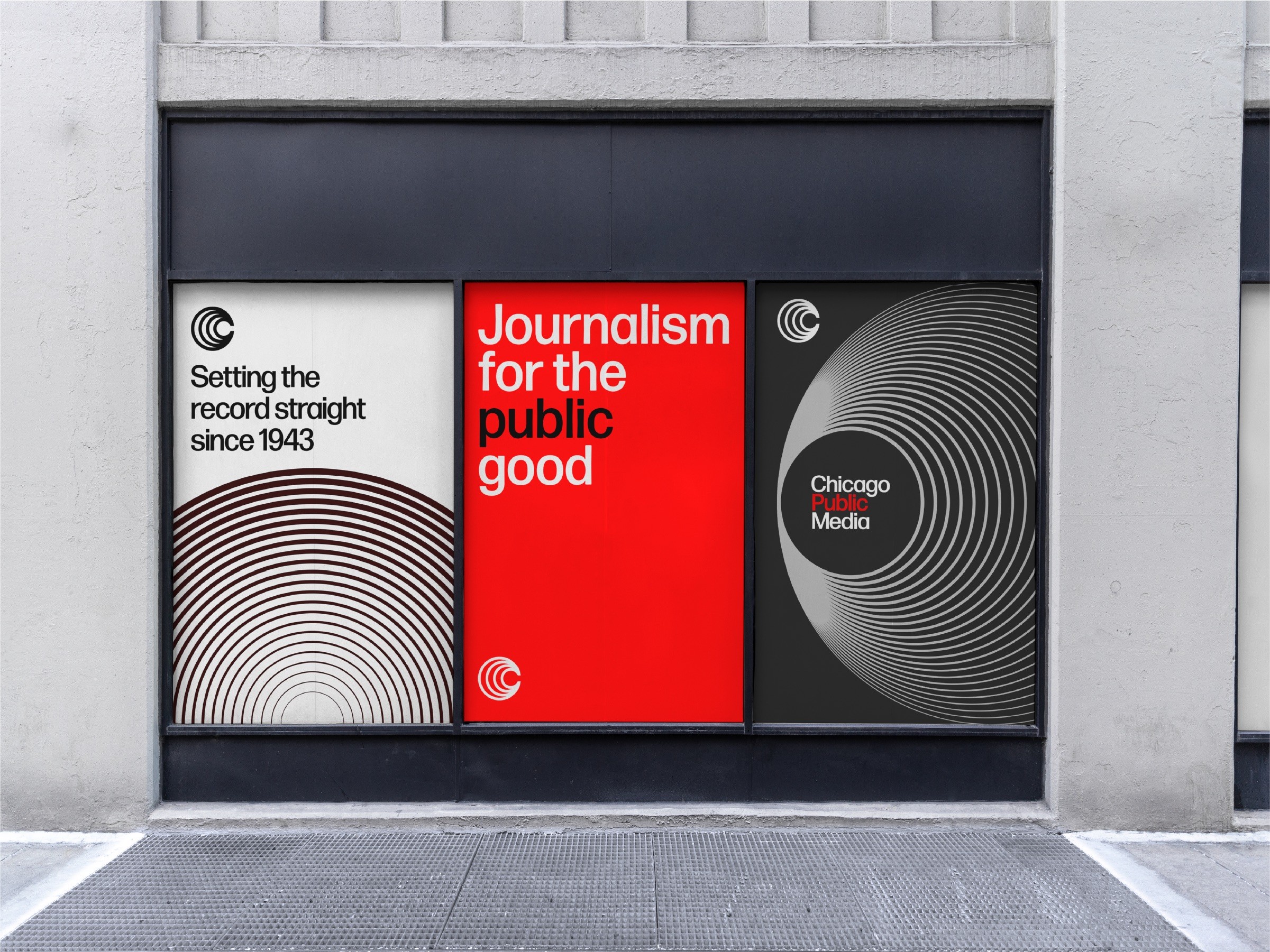
Chicago Public Media's brand identity embodies the concept of disseminating information to the public. The logo, featuring resonating concentric circles, reflects the organization's role as a central, trusted source. Visuals utilize dynamic patterns and focal points, always positioning Chicago Public Media as the heart of the message. The color palette uses black and white as a homage to traditional print media, while the bold, red accent poses as the amplification of the peoples' voice. The tagline, "Journalism for the public good," underscores the brand's commitment to community-centered reporting.
Chicago Public Media's brand identity embodies the concept of disseminating information to the public. The logo, featuring resonating concentric circles, reflects the organization's role as a central, trusted source. Visuals utilize dynamic patterns and focal points, always positioning Chicago Public Media as the heart of the message. The color palette uses black and white as a homage to traditional print media, while the bold, red accent poses as the amplification of the peoples' voice. The tagline, "Journalism for the public good," underscores the brand's commitment to community-centered reporting.
Chicago Public Media
Branding • VSA Partners
Chicago Public Media's brand identity embodies the concept of disseminating information to the public. The logo, featuring resonating concentric circles, reflects the organization's role as a central, trusted source. Visuals utilize dynamic patterns and focal points, always positioning Chicago Public Media as the heart of the message. The color palette uses black and white as a homage to traditional print media, while the bold, red accent poses as the amplification of the peoples' voice. The tagline, "Journalism for the public good," underscores the brand's commitment to community-centered reporting.


